 + Sturm
“The university increased its first preference applications by 16 percent. I was ranked by CMO Magazine as one of the top 50 marketers in Australia. The marketing team won an Australia/New Zealand award and this was all off the back of our work with Ben, Duncan and the team on Course Finder.”
— Jamie McDonald, Director of Marketing, Federation University Australia
Federation University Australia
Federation University (FedUni) has a long history, providing education and training for more than 145 years. Now regional Victoria's largest education institution, FedUni has over 1,300 staff, 21,000 students and campuses in Ballarat, Berwick, Brisbane, Gippsland and the Wimmera.
“We're well known for our five star ranking in teaching quality, awards for student support and the leaders, dreamers, teachers, thinkers and doers that work and study here,” explained Jamie McDonald, Director of Marketing. “One of our points of difference is that we provide pathways for people of all ages and backgrounds to study at a tertiary level. Rather than finding reasons to turn people away, we're always asking what we can do to help them achieve their goals.”

We were bleeding students
“When I started as Director of Marketing in 2015,” said McDonald, “I met each of the Deans face-to-face to understand their faculties, courses and the pressure-points they faced. It was just unbelievable — the universal complaint was that we had these great courses, but were not able to communicate them effectively to prospective students. You may or may not find them on our website. If you did, there was no prospective student-crafted information; our online course guide Program Finder was all flat and procedural. It was hard to use and as stereotypically 'academic' as you can get; oriented towards the university's legislative requirements rather than student needs. We were bleeding students.”
“The higher-education sector is one of the most competitive sectors in any market. If you think banking or health insurance, higher-ed is Australia's third largest export and the marketing and promotion to recruit students is a multi-million dollar business, even for a small regional university. Our marketing efforts were hitting brick walls. We could create all this demand and these great campaigns, but when students arrived at our digital front door we'd lose them. It was acknowledged across the board that this bad experience was costing the university students; it was costing our brand because the first experience of looking for a course was a bad one.”
“From the business side, it wasn't meeting our needs either. Program Finder was universally hated across the university. It was all manually updated, constantly out of date and contradictory. What used to happen all the time was that Marketing would update a section, then Student Admin would say, ‘oh, well that didn't actually get approved though academic board’, so they'd revert it back. It would be updated twice, but still be incorrect. A faculty would say, ‘why haven't you made that change; we told you about it 3 weeks ago’. We'd say ‘we made it’ and they'd say ‘no you haven't, look’ and you wouldn't even know who had changed it, because it would have been done with a generic email of ‘admin@federation.edu.au’.”


The great thing was that it launched on time; what launched was what we asked for; it worked how we asked for it to work and it was adaptable. It was one of those great projects that met the customer needs, but also met and exceeded the organisation's needs. It's the best IT project I've ever done and I'm really proud of it.
— Jamie McDonald, Director of Marketing
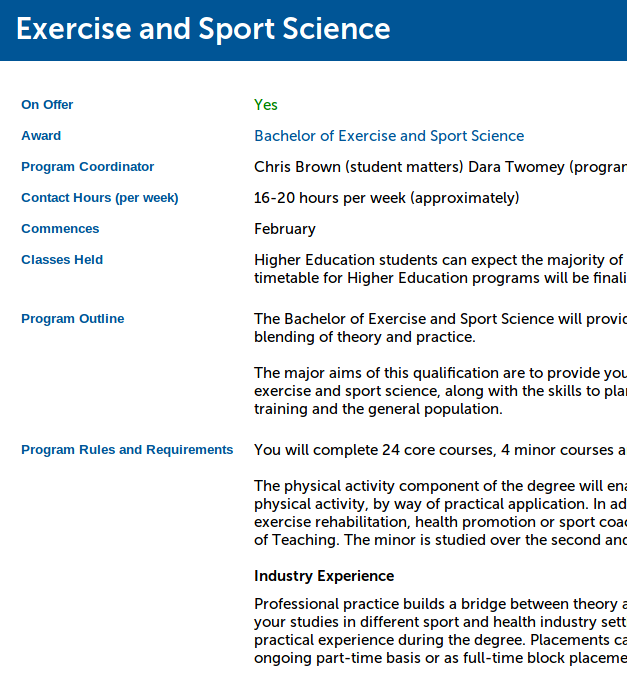
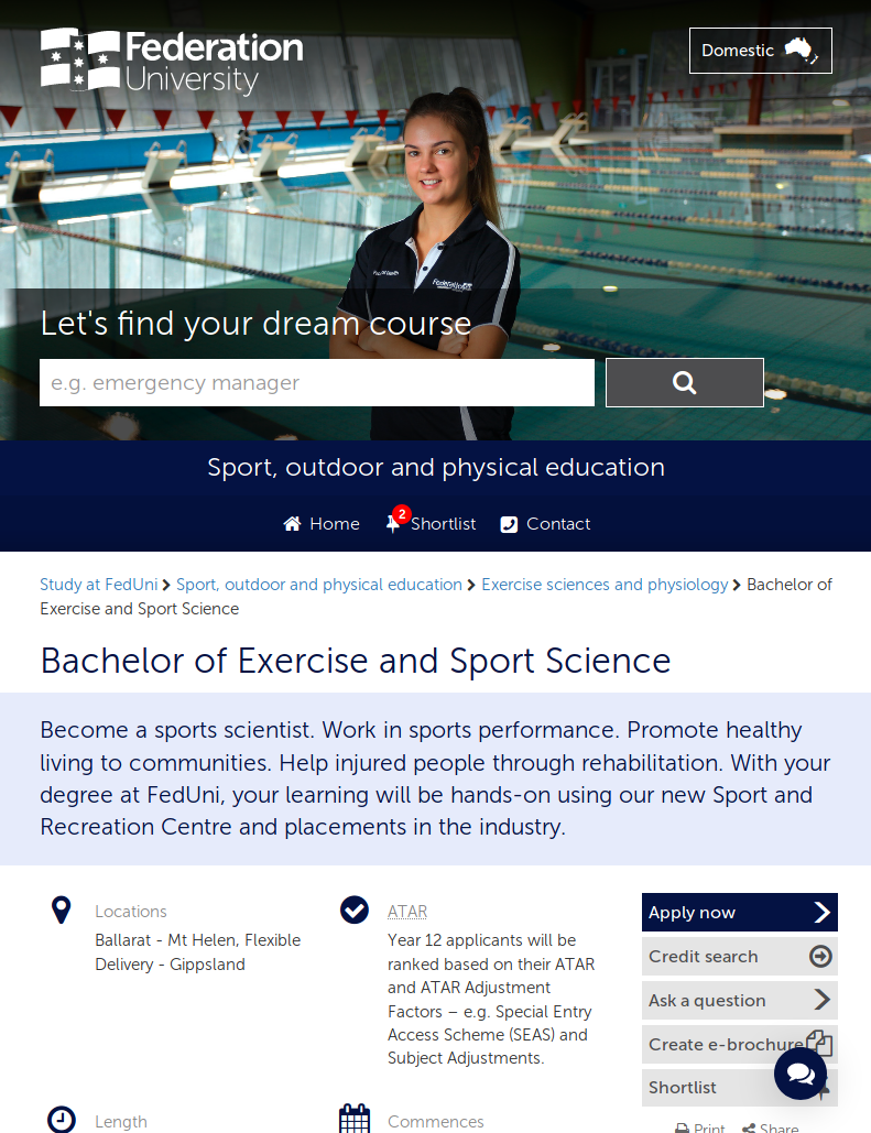
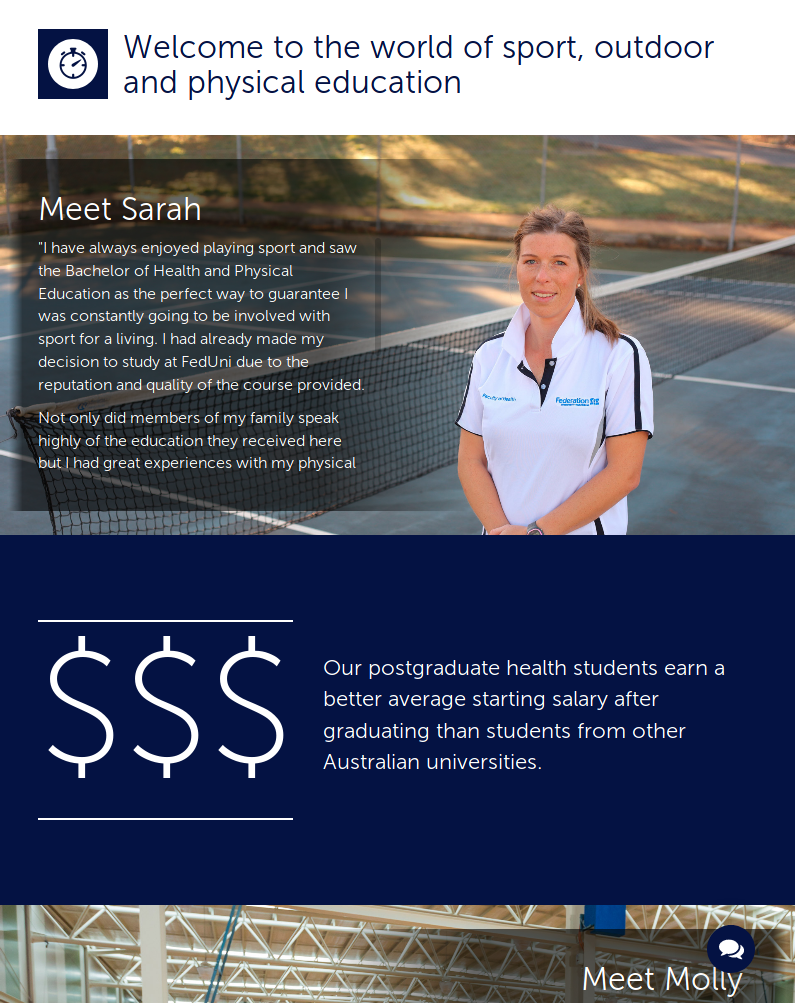
Sturm Software Engineering ran a wide-ranging consultation with staff and students to plan for their current and future needs.
The review findings highlighted the pain-points for staff and students within the current information systems and identified and prioritised number of major opportunities to engage more effectively. This review fed into a a graphic design brief for Publicis Cubed, major rewrite of the course information material and a twelve-month complete redesign and rebuild of the online course information system by Sturm Software Engineering, Cartesian Creative and a project team from Fed Uni.
“The university organisation was massively engaged with this project,” said McDonald. “We'd often have 30-50 staff attending our bi-weekly progress demos. Projects are often compromised by people jumping up and down about a particular thing, but what was great about how it was managed and built was that they were taken on the journey with us. What we built was what the market needed and wanted, rather than what an individual felt worked for them.”
The project focused on 3 areas:
1. A more engaging experience for prospective students
We redesigned the course information system from the ground up to reflect FedUni's focus on people, relationships and careers. We prioritised and highlighted the key information and actions needed by students such as campus locations, ATAR entry requirements and contacting a student adviser to ask questions. We added engaging imagery to show students that university is hands on, social and beyond the classroom. We grouped courses by occupation and study area rather than faculty. We worked patiently but persistently with the faculties to encourage them to switch from internal US-oriented terminology ("programs" and "courses") to external student-friendly terminology ("courses" and "subjects"). We eliminated the dry and wordy "university-speak" in course summaries and provided model alternatives that were personal, emotive, engaging and brief.
“For me personally, it meant that we could focus on our marketing activities, our advertising, our promotions, knowing that when we got students to the digital door of the university that Course Finder would do it's job; from interest to application and eventually to enrolment,” said McDonald. “We could develop strong campaigns with specific copy and imagery and they linked through and were reflected in Course Finder. The customer journey was built, and we could focus on creating the demand.”
“It wasn't a surprise it was a success; we knew it was going to be a success 6 months out because of how we worked on it. We laboured over decisions together. And instead of just being just someone's opinion, we tested it with students. The team did the the student focus groups. It wasn't filtered through marketing or communications people.”
2. Appropriate tools for life-changing decision making
Sturm and Cartesian Creative built a clean, fast and mobile-friendly course information website that is sympathetic to the challenging process of finding and choosing a tertiary course allowed students to rapidly explore a wide range of careers and related courses without being overwhelmed. Students can short-list and compare the courses that interest them, filtering by location and qualification type. As needed students can drill down into the full details about courses to find everything they need in one place, reading about individual subjects, calculating their fees and estimating credit for prior study. When the student is ready to take the next step, they can easily contact an adviser or apply to study.
“This was a brand new system, not just putting a new skin on an old system,” explained McDonald. “It had to be able to adapt because courses change all the time; prospective students needs change, the imagery, the language used to describe courses, and of course government policy changes, so we couldn't do a traditional waterfall approach because we would set the requirements then step away and build and then what we delivered would no longer be appropriate for the market. So for me it introduced my to agile, which was a great experience.”
3. Dramatically simplified the internal processes for staff
Prior to the new Course Finder system, course information was duplicated across two large internal systems within the university. The first for enrolment, fees and legislative requirements (Campus Solutions) and the second for course information and marketing (Program Finder). This duplication caused a great deal of double-handling for teaching and administrative staff, complicated and labour-intensive processes for preparing course information and marketing publications and information being provided to students that was out of date or inconsistent.
The new Course Finder system was initially added alongside the existing course information system. We then undertook the painstaking process of merging the two sources of course data. The end result of which was a single consistent and high-quality source of data for all course information and a greatly reduced workload for both faculty, marketing and IT staff.
“The new Course Finder was suddenly a lot faster,” said McDonald. “Instead of staff having to manually update everything, the information flowed directly through from our sources of truth in Campus Solutions and elsewhere. We had an absolutely clear colour-coded schematic of where each section of data was drawn from. We knew when those were updated and who was responsible.”
“It's amazing the contrast between now and then; Course Finder is so good that people at Fed Uni now don't realise how much thought and care and great collaborative work went into creating this market-leading tool. We crafted a tool that was universally recognised across the university as a complete turnaround in how we recruited and nurtured prospective students; and by our competitors it was seen as just a benchmark tool in university course searching.”